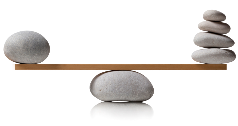
While creating any graphic design there are different elements that must be taken care of. You need to put emphasis on the various principle of graphic designing that will allow you create the best graphics. Now, while you concentrate on contrast, emphasis and unity you must not forget about the visual balance that is most important for designing graphics.
What is balance in graphic designing?
Placements of various elements in graphic design are known as its balance and while you place elements their visual weight must be considered. Like, while designing if you place a lighter color beside a darker color, the darker element will seem heavier in the design.
Just think will you prefer entering a building that is leaning over one side? Never, this is same for graphics designs too. People have a tendency that they prefer such things that seems stable to them. Humans look for balance everywhere and it is also important in graphic designing too.
Sense of balancing is important in any graphics because if the image is not balanced then the viewers will not understand where to look at. In such situation you will not be able to communicate the message that you want to convey. In the design you also need to have focal point and then balance it according to it.
Thus, while designing it is necessary that you consider the focal point and then distribute the elements in such way that the overall visual balance is maintained.
Now, balancing does not mean that you have to place every element symmetrically! You can balance your graphic with asymmetrical distribution of elements too. It is just like a see-saw that you must have played when you were young. It is not how many children sit on one side. It is how you balance the heaviest child with others. Same is the concept of balancing in graphic designing.
Symmetrical Balance
In symmetrical balance you need to distribute the weight evenly, either horizontally or vertically. For visual balancing you may draw a straight line from the middle of the design. This will help you balancing the elements evenly. This type of composition gives a orderly look and it also appears to be stable.
While designing you may do some experiment and change the color of one side to darker shade. You will find that the side with darker shade will seem heavier than the lighter one. Thus, in symmetrical balance you just do not need to balance the placement of the elements but also the shades of color that affects the symmetry. A symmetrical balance will give you graphics that are cool for eyes but sometimes they may not be highly interesting.
Balance Through Asymmetry
As the name suggests in this type of balancing you do not distribute the elements symmetrically yet there is some balance in the graphics. You may find that one side is heavier than the other but yet it gives a message that is clear to the eyes.
In this type of balancing you try to create visual interest by positioning the different sized elements in such way that although they are not evenly placed they balance each other.
Disclaimer: All images are copyrighted to their respective owners.

