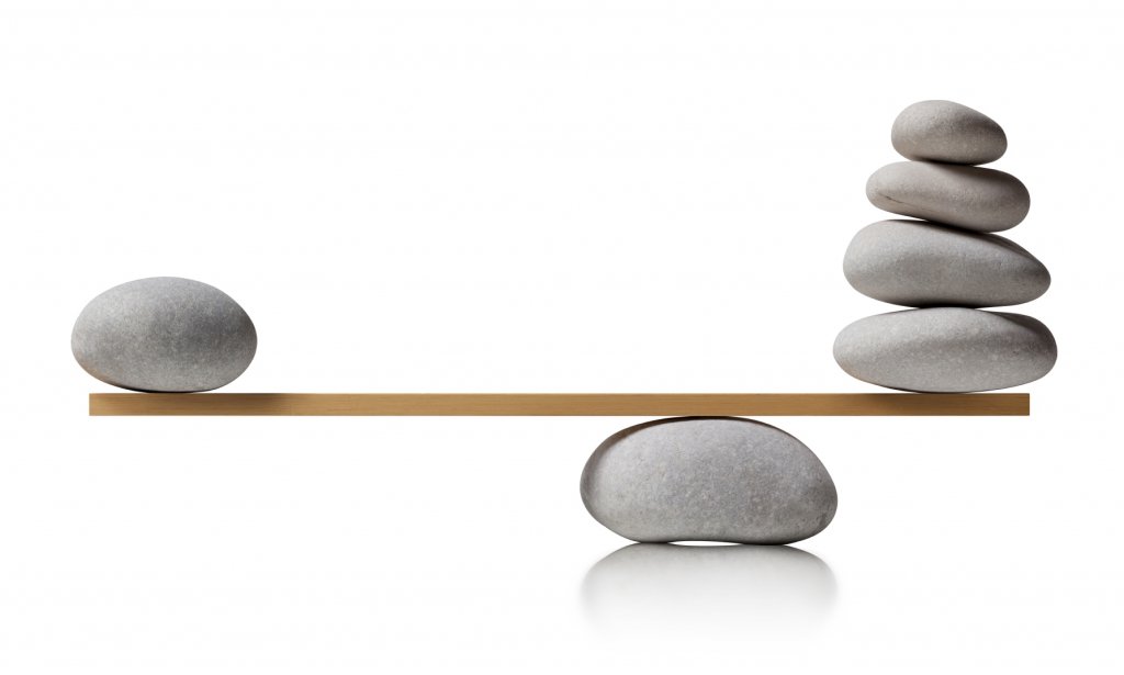
While a graphic designer designs any graphic art they bring in life the visual elements with the help of flavor and color. For conveying the message effectively there are different ways but among them balancing is most important.
In any graphic art, balancing is the most delicate process as when there are so many images and other elements in the design, its proper balancing of the images that brings all of them into life. And in all this text plays an important role, where a heading beside an image can make it lively.
In this context the first thing that comes in mind is when a design needs to be balanced.
When should designs be balanced?
It does not depend upon the type of artwork done for balancing the designs. Whether it’s a flyer, a brochure, a website or a magazine every design needs to be balanced so that it looks attractive in the eyes of the viewers. When the designer works with both text and graphics the necessity of balancing becomes more important.
When a design is perfectly balanced it is not only appealing but also conveys the message correctly. It provides the design a visual structure and thus conveying the message becomes ease.
Considerations when balancing text and visual elements
There is a misconception that when you are balancing an artwork it must be symmetrical! Actually balancing has nothing to do with symmetry. Whether a design is asymmetrical or seems as ‘out of balance’, it must be visually appealing and the image and the text must be in harmony with each other for making the whole thing balanced.
For balancing any artwork that has both image and text the first thing that you must understand is which element of the design will be the focal point. It should have most impact over the graphics. Once the focal point is set you can start balancing other elements in accordance to it. For balancing you need to consider the positioning, texture, tone, contrast and size of each element that comprises the design.
The next consideration a graphic designer needs to understand is that they understand what they are creating and how the text matches with the hierarchy of the images. It may seem obvious to most graphic designers but in hurry this is overlooked. Hence, due importance must be given to the hierarchy of images and the texts also.
For balancing the text with the visuals first you need to draw a mind map where you will place each image and texts accordingly. You can even try out a quick sketch that will help you produce a good one at the end.
Now, once the rough work is completed, it’s time to draw the links between the images and the text. Is due importance to be given to the heading text or the ones at the body? For getting more help while balancing the artwork, working in grid layout is also very effective. The grid will help you visualize the balance of the artwork clearly.
Disclaimer: All images are copyrighted to their respective owners.

