Colors plays an important role in graphic designing and whether its designing on clothes or on any other Poster, the contrast between black and white plays a major role in making the designs attractive. Experts believe that in any design if there is partnership between black and white, it becomes an ideal match of the opposites.
Black and white- contrast at their best
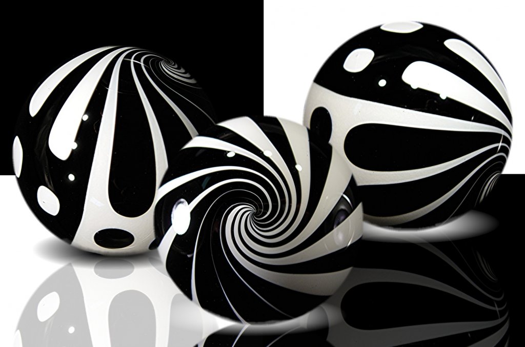
Any graphic designer creates an artwork with their creativity that will be appealing to the audience. In such case its black and white that is being used by designers for ages and they are indeed appealing.
The main reason may be it’s the purity of white that gets coupled with the mysterious black for creating a final image that give proper balance to the eyes. This balance can create a powerful emotional response for those who are viewing it.
The impact of black and white on any graphic design is indeed great and that is why most of the time while designing any Cloth graphics these two colors are used. In print design the impact of these two colors has become a popular choice over time among those who are creating these designs for cloths or even for posters.
Designing graphics with black and white
Those designers who prefers to use this two tone of colors for their graphic designs wants to make sure that they have taken care of the composition and balancing. Composition is the key details for making such artwork with black and white appealing as there will be no popping colors that will attract the vision; rather it’s the illustrations, typeface used and the graphics that will be responsible for making the artwork click.
While designing any poster with black and white it is not necessary that they two colors must be distributed in half and half. They can be used in any ratio that will bring out the message or make the artwork look classy. Every poster is designed with the aim of conveying some message, be it normal one or political. Hence, depending upon the message and the graphic design the ratio of both the colors in the composition is to be decided.
Different elements of the design namely the text, pattern , texture and others plays an important role in making a black and white artwork click and one they do they really have great impact on the audience. It’s not only keeping the shape and size equal the other elements also need proper spacing.
Create brand awareness best with two extremes
For many graphic designer designing and creating any brand awareness with these two colors is really challenging. They highlight different designs based on these two extreme colors that create a different impact on the audience. The brand will be able to create sharp and clean collateral for highlighting their messages in a strong way.
Apart from creating magic on the poster or the cloth there is another advantage of suing these two colors in designing. Getting the print copy becomes cheaper than using different colors for printing.
Disclaimer: All images are copyrighted to their respective owners.